Colour Pairing: Choosing Shades That Work Together for Going-Out Looks


Colour pairing: choosing shades that work together is the practice of picking two or three colors that sit well side by side in one outfit, using contrast, warmth or tone to make a look feel intentional rather than accidental. Most outfit regrets come down to color, not cut. At LPA, we think about colour pairing: choosing shades that work together the same way we think about fit: it should feel effortless, even when it’s carefully considered.
Key takeaways
- Pick one color approach on purpose: complementary, analogous, or monochrome, rather than guessing.
- Match warm tones with warm tones and cool tones with cool tones for the most reliable results.
- Neutrals like camel, chocolate, and ivory make it easy to build outfits around one bold color.
- Shoes count as part of your color palette, not an afterthought.
- Bright, saturated colors work especially well for swim and resort looks in daylight.
Why Colour Pairing: Choosing Shades That Work Together Matters More Than Any Single Piece
You can own a beautiful dress and still feel off in photos if the shoes or jacket fight it. Colour pairing is what turns separate pieces into an outfit. It’s also the fastest way to make a simple silhouette look expensive, because clean, well-matched color reads as polish even when the shapes are basic.
This matters even more for going-out and event dressing, where you’re often mixing a top, a skirt, and shoes rather than wearing one dress. Every seam where two pieces meet is a chance for the colors to either click or clash. Browse the full range at LPA and you’ll notice most LPA pieces are designed with this in mind: shades that were built to sit next to each other, from corset tops to skirts to shoes.
Start With the Color Wheel, Not Your Closet
Before you pull anything out, think in three simple categories: complementary, analogous, and monochrome. Complementary colors sit opposite each other on the wheel (think burgundy and olive, or cobalt and rust). Analogous colors sit next to each other (blush, coral, and terracotta). Monochrome means different shades of one color family, like ivory, camel, and chocolate together.
Good colour pairing: choosing shades that work together usually starts by picking one of these three approaches on purpose, rather than grabbing whatever’s clean in the laundry. If you’re not sure where to start, monochrome is the safest entry point because it removes most of the guesswork. A cream co-ord set with tan shoes, for example, reads as effortless without any real risk.
A Quick Reference for Going-Out Looks
| Base Color | Easy Pairing | Best For |
|---|---|---|
| Black | Emerald or cherry red | Dinner, date night |
| White or ivory | Camel, gold, or sky blue | Brunch, daytime events |
| Chocolate brown | Cream, burnt orange, sage | Fall weddings, holiday parties |
| Cobalt blue | Silver, white, or mustard | Summer nights out |
Warm Versus Cool: The Rule That Actually Holds Up
Most mistakes in colour pairing happen when you mix a warm shade with a cool shade without meaning to. A warm red (leaning orange) next to a cool pink (leaning blue) will fight, even though both are technically in the same color family. The fix is simple: pick one temperature per outfit. If your dress or top leans warm, keep your shoes and accessories warm too. If you’re wearing a cool-toned skirt, stay in cool metals like silver rather than gold.
This is especially useful when you’re building a look around one statement piece. Say you’ve picked an LPA corset top in a warm terracotta. Pairing it with a cool-toned denim skirt can undercut the whole look, while a warm camel or cream skirt will let the top do the talking. The same logic applies to shoes: a warm nude heel almost always reads better with warm-toned pieces than a cool, ashy nude does.
Building an Outfit Around Neutrals
Neutrals do a lot of quiet work in colour pairing: choosing shades that work together well is often about knowing which neutral to lean on. Black, ivory, camel, and chocolate are the four workhorses, and each one changes the mood of an outfit. Black tends to feel formal and a little more serious, which makes it a safe base for dinner or a cocktail party. Ivory and cream feel softer and work well for daytime events, brunch, or garden parties.
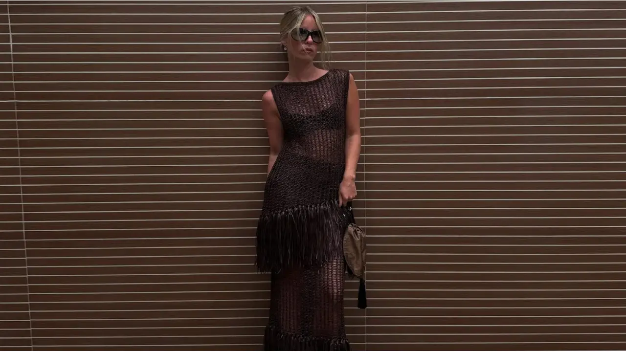
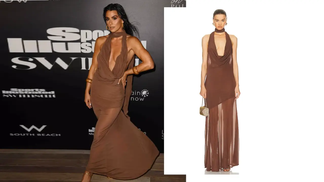
Camel and chocolate brown are underrated for going-out dressing because they pair with almost every jewel tone without competing for attention. A camel skirt under an emerald top, or a chocolate slip dress with gold jewelry, both use neutrals to let one bright color lead. LPA’s skirts and co-ord sets in these tones are easy building blocks precisely because they don’t demand a perfect match, just a complementary or analogous partner.
Colour Pairing for Swim and Resort Looks
Swim and resort dressing follow slightly different color rules than evening dressing, mostly because you’re outdoors, often near water, and working with more skin exposure. Bright, saturated colors read beautifully in daylight in a way they sometimes don’t under indoor lighting. A cobalt or emerald bikini top with a printed sarong in a complementary shade is a classic resort combination that photographs well.
If you want an easier entry point, start with LPA’s bikini collection and build outward from there, choosing a cover-up or sandals in one of the shades already present in the print. This is colour pairing at its simplest: let one piece set the palette, then repeat two of its colors elsewhere in the outfit.
Common Colour Pairing Mistakes to Avoid
The most common mistake is pairing too many bold colors at once without a neutral to anchor them. Three saturated colors in one outfit can feel busy rather than intentional. A second common mistake is ignoring undertones, wearing a warm gold necklace with a cool silver-toned dress, for instance, which creates a subtle but noticeable clash.
A third mistake is forgetting that shoes count as color too. A neutral dress with the wrong-toned shoe can throw off an otherwise perfect colour pairing: choosing shades that work together should include footwear from the start, not as an afterthought once the outfit is already decided.
Frequently Asked Questions
What is colour pairing in fashion?
Colour pairing is the practice of choosing two or three colors to wear together based on how they relate on the color wheel, using complementary, analogous, or monochrome combinations to make an outfit feel put together.
What colors go with black for a night out?
Black pairs easily with emerald, cherry red, cobalt, and metallics like gold or silver. These jewel tones stand out against black without needing to match it exactly.
Is it okay to mix warm and cool tones?
It can work, but it’s harder to pull off. Most reliable outfits pick one temperature, warm or cool, and stay consistent across the top, bottom, and shoes.
How many colors should one outfit have?
Two or three is usually the sweet spot. One dominant color, one supporting color, and an optional neutral or metallic accent keeps things balanced without looking busy.
Do shoes need to match the outfit color exactly?
No, shoes don’t need to match exactly, but they should relate to the palette. A complementary or neutral shoe usually works better than an exact match, which can look flat.
Ready to put this into practice? Shop LPA’s dresses, tops, skirts, co-ord sets, and shoes to build your own reliable colour pairing: choosing shades that work together system, one outfit at a time, and let LPA be the starting point for every palette you build.